From Raw Data to Actionable Customer Groups
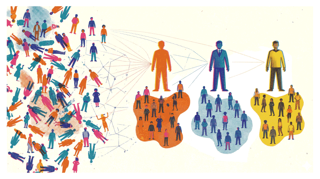
In today’s competitive retail landscape, understanding your customers is not just helpful—it is essential for survival. Customer segmentation with K-Means clustering offers a powerful, data-driven method to group shoppers based on shared characteristics. Instead of relying on gut feelings, businesses can use this technique to identify distinct customer archetypes. Consequently, marketing campaigns become more targeted, inventory decisions improve, and customer loyalty strengthens. In this project, we will apply customer segmentation with K-Means clustering to the popular Mall Customer Segmentation Dataset.
- Dataset: Mall Customer Segmentation Dataset (Kaggle) – 200 shoppers with age, annual income, and spending score.
- GitHub Repository: View on GitHub – Complete code and notebook for this project.
Our goal is straightforward: segment these customers into meaningful groups and build a business profile for each segment. We will follow a complete machine learning workflow—from exploratory data analysis and feature scaling to optimal cluster selection and profile interpretation. If you are new to data science, you might also enjoy our guide on Brazilian E‑Commerce EDA.
Analysis Roadmap
- Load and Explore Data – Examine distributions of age, income, and spending score.
- Scale Features – Use StandardScaler to normalize the data.
- Find Optimal K – Apply the elbow method and silhouette score to determine the best number of clusters.
- Fit K-Means Model – Train the algorithm and assign cluster labels to each customer.
- Visualize Clusters – Create a 2D scatter plot of income versus spending score.
- Profile Each Cluster – Compute mean values for age, income, and spending per segment.
- Name and Interpret Segments – Assign business‑friendly names and actionable insights.
Note: All code is written in Python using scikit-learn, Pandas, Matplotlib, and Seaborn. The full code blocks follow each explanatory section.
Step 1: Data Loading and Distribution Exploration
The first step in any customer segmentation with K-Means clustering project is understanding the raw data. We load the CSV file into a Pandas DataFrame and examine the first few rows. Additionally, visualizing the distribution of key features—Age, Annual Income, and Spending Score—helps identify patterns and potential outliers. For instance, a quick glance at the histograms reveals that most customers are between 20 and 40 years old, with annual incomes ranging from $15k to $140k.
What This Step Reveals
- The dataset contains 200 entries with no missing values—a clean starting point.
- Spending scores range from 1 to 100, with a relatively uniform distribution.
- Income and age distributions show some skew, which is typical for demographic data.
Code Preview (what follows): pd.read_csv(), df.head(), and sns.histplot() for distribution plots.
import pandas as pd
import matplotlib.pyplot as plt
import seaborn as sns

# 1. Load the dataset
df = pd.read_csv('Mall_Customers.csv')

# Display the first few rows to verify
display(df.head())

# 2. Explore distributions
plt.figure(figsize=(16, 5))

# Age Distribution
plt.subplot(1, 3, 1)
sns.histplot(df['Age'], bins=20, kde=True, color='skyblue')
plt.title('Age Distribution')

# Annual Income Distribution
plt.subplot(1, 3, 2)
sns.histplot(df['Annual Income (k$)'], bins=20, kde=True, color='lightgreen')
plt.title('Annual Income Distribution')

# Spending Score Distribution
plt.subplot(1, 3, 3)
sns.histplot(df['Spending Score (1-100)'], bins=20, kde=True, color='salmon')
plt.title('Spending Score Distribution')

plt.tight_layout()
plt.show()Step 2: Scaling Features for Fair Distance Calculations
K-Means clustering relies on distance measurements (Euclidean distance) to assign points to centroids. Consequently, features with larger numerical ranges—such as Annual Income (ranging from 15 to 137)—would dominate features with smaller ranges—like Age (18 to 70). To prevent this bias, we apply StandardScaler from scikit-learn. This transforms each feature to have a mean of zero and a standard deviation of one. As a result, every feature contributes equally to the clustering process.
Why Scaling is Crucial
- Unscaled data can lead to distorted clusters dominated by high-magnitude variables.
- Standardization ensures that the algorithm treats all features with equal importance.
- This step is particularly important when features have different units (e.g., dollars vs. years).
Code Preview (what follows): from sklearn.preprocessing import StandardScaler, scaler.fit_transform().
from sklearn.preprocessing import StandardScaler

# Select features for clustering
features = ['Age', 'Annual Income (k$)', 'Spending Score (1-100)']
X = df[features]

# Initialize and fit-transform the scaler
scaler = StandardScaler()
X_scaled = scaler.fit_transform(X)

# Convert back to a DataFrame for easier handling
X_scaled_df = pd.DataFrame(X_scaled, columns=features)
display(X_scaled_df.head())Step 3: Determining the Optimal K with Elbow Method and Silhouette Score
A critical question in customer segmentation with K-Means clustering is: how many clusters should we create? We employ two complementary techniques to answer this. First, the elbow method plots the inertia (sum of squared distances to centroids) against different values of K. The “elbow” point—where the rate of decrease sharply slows—suggests a good trade‑off between model complexity and fit. Second, we compute the silhouette score, which measures how similar a point is to its own cluster compared to other clusters. Scores closer to 1 indicate well‑separated clusters.
In our analysis, the elbow plot shows a noticeable bend around K=5 or K=6. Meanwhile, the silhouette score peaks at K=6. Therefore, we select six clusters for the final model. For a deeper dive into clustering evaluation, check out our Retail Sales Aggregation project, which also involves segmenting performance metrics.
Code Preview (what follows): Loop over K values from 2 to 10, compute KMeans.inertia_ and silhouette_score(), then plot both metrics.
from sklearn.cluster import KMeans
from sklearn.metrics import silhouette_score

inertia = []
silhouette_scores = []
K_range = range(2, 11)

for k in K_range:
    # Set n_init to suppress warnings and ensure stability
    kmeans = KMeans(n_clusters=k, random_state=42, n_init=10)
    kmeans.fit(X_scaled_df)

    inertia.append(kmeans.inertia_)
    silhouette_scores.append(silhouette_score(X_scaled_df, kmeans.labels_))

# Plotting the results
fig, axes = plt.subplots(1, 2, figsize=(14, 5))

# Elbow Method Plot
axes[0].plot(K_range, inertia, marker='o', linestyle='--')
axes[0].set_title('Elbow Method (Inertia)')
axes[0].set_xlabel('Number of Clusters (K)')
axes[0].set_ylabel('Inertia')
axes[0].set_xticks(K_range)

# Silhouette Score Plot
axes[1].plot(K_range, silhouette_scores, marker='s', linestyle='--', color='orange')
axes[1].set_title('Silhouette Score')
axes[1].set_xlabel('Number of Clusters (K)')
axes[1].set_ylabel('Silhouette Score')
axes[1].set_xticks(K_range)

plt.tight_layout()
plt.show()Step 4: Training the K-Means Model with Optimal K
With the optimal number of clusters determined (K=6), we instantiate a KMeans object from scikit-learn and fit it to the scaled data. The fit_predict() method conveniently returns the cluster labels for each data point. We then append these labels as a new column in our original DataFrame. This allows us to analyze the characteristics of each segment in subsequent steps.
Model Parameters
- n_clusters=6 – the number of segments we identified.
- random_state=42 – ensures reproducibility of the centroid initialization.
- n_init=10 – runs the algorithm multiple times with different seeds to find stable results.
Code Preview (what follows): KMeans(n_clusters=6, random_state=42, n_init=10), .fit_predict(), and adding a ‘Cluster’ column.
# Choose optimal K based on the plots above
optimal_k = 6

# Fit the final model
final_kmeans = KMeans(n_clusters=optimal_k, random_state=42, n_init=10)
df['Cluster'] = final_kmeans.fit_predict(X_scaled_df)

display(df.head())Step 5: Visualizing Customer Segments in 2D Space
Although our clustering model used three features (Age, Income, Spending Score), we can project the results onto two dimensions for intuitive visualization. A scatter plot with Annual Income on the x‑axis and Spending Score on the y‑axis, colored by cluster label, provides an immediate sense of how customers group together. For example, one cluster appears in the high‑income, high‑spending quadrant—clearly a premium segment. Another cluster shows low income but high spending, indicating impulse‑driven behavior.
This visual insight is invaluable for marketing teams. It transforms abstract cluster numbers into tangible, actionable groups. Moreover, it validates that our customer segmentation with K-Means clustering has produced logically separated cohorts. For another example of visual storytelling in data science, see our House Price Prediction project.
Code Preview (what follows): sns.scatterplot() with hue=’Cluster’ and palette=’tab10′.
plt.figure(figsize=(10, 6))
sns.scatterplot(
    data=df,
    x='Annual Income (k$)',
    y='Spending Score (1-100)',
    hue='Cluster',
    palette='tab10',
    s=100,
    alpha=0.8
)

plt.title('Customer Segments: Annual Income vs. Spending Score')
plt.xlabel('Annual Income (k$)')
plt.ylabel('Spending Score (1-100)')
# Move legend outside the plot
plt.legend(title='Cluster', bbox_to_anchor=(1.05, 1), loc='upper left')
plt.tight_layout()
plt.show()Step 6: Building Cluster Profiles with Mean Values
Visualization is powerful, but numbers tell the precise story. To create actionable business profiles, we compute the mean values of Age, Annual Income, and Spending Score for each cluster. We also count the number of customers in each segment. The resulting table reveals clear patterns. For instance, one cluster (let’s call it Cluster 2) has an average income of $88.9k but a spending score of only 17.0. These are high‑earners who are not spending—a classic “at‑risk” or “careful saver” segment.
On the other hand, Cluster 3 shows an average income of $86.5k and a spending score of 82.1. This is the “VIP” or “target” group—customers with both the means and the willingness to spend. Marketing efforts should prioritize retaining and upselling this cohort. This type of profiling is similar to the segmentation done in our Titanic Survival Prediction project, where we examined passenger characteristics by survival status.
Code Preview (what follows): df.groupby(‘Cluster’)[features].mean() and adding a ‘Customer Count’ column.
# Compute mean values for Age, Income, and Spending per cluster
cluster_profile = df.groupby('Cluster')[features].mean().round(1)

# Add the number of customers in each cluster
cluster_profile['Customer Count'] = df.groupby('Cluster')['CustomerID'].count()

display(cluster_profile)Step 7: Assigning Business Names to Customer Segments
The final and most crucial step in customer segmentation with K-Means clustering is translating statistical clusters into meaningful business personas. Based on the cluster profiles we generated, we can assign descriptive names that resonate with marketing and sales teams. Here is a summary of the six segments we identified:
- VIP / Target (Cluster 2): High income, high spending. These are the most valuable customers. Reward them with loyalty programs and exclusive offers.
- Careful Savers (Cluster 0): High income, low spending. They have purchasing power but are cautious. Focus on quality messaging and long‑term value.
- Impulse / Careless Spenders (Cluster 4): Low income, high spending. They are responsive to promotions but pose a credit risk. Engage with limited‑time discounts.
- Sensible / Budget (Cluster 3): Low income, low spending. Price‑sensitive shoppers. Target them with essential items and value bundles.
- Mainstream – Older (Cluster 1): Average income, average spending, older demographic. Steady, reliable customers.
- Mainstream – Younger (Cluster 5): Average income, average spending, younger demographic. Potential for future growth.
By adding a ‘Segment_Name’ column to our DataFrame, we create a final dataset ready for CRM integration. This allows the business to send targeted emails, adjust product recommendations, and allocate marketing budgets more efficiently. Ultimately, customer segmentation with K-Means clustering moves organizations from mass‑marketing to personalized engagement.
Further Reading: Explore more machine learning projects on our projects page or dive into scikit-learn’s clustering documentation.
# Look at your cluster_profile output to map these names correctly!
# Below is a conceptual mapping assuming standard K-means centroid placements.

segment_names = {
    # High income, High spending -> Most valuable demographic
    "VIP / Target": "High Income, High Spending. Ready to buy premium products.",

    # High income, Low spending -> Need convincing, focus on value/durability
    "Careful Savers": "High Income, Low Spending. Have purchasing power but are cautious.",

    # Low income, High spending -> Highly driven by trends or impulse
    "Impulse / Careless Spenders": "Low Income, High Spending. High risk, but responsive to sales.",

    # Low income, Low spending -> Focus on essential / budget goods
    "Sensible / Budget": "Low Income, Low Spending. Price-conscious shoppers.",

    # Average income, Average spending (Often splits into two by age: younger vs older)
    "Mainstream Standard": "Average Income, Average Spending. The bulk of normal mall traffic."
}

# Example of how you would map them in code (adjust the keys 0-5 to match your profile table):
cluster_naming_map = {
    0: 'Careful Savers',
    1: 'Mainstream (Older)',
    2: 'VIP / Target',
    3: 'Sensible / Budget',
    4: 'Impulse / Careless Spenders',
    5: 'Mainstream (Younger)'
}

df['Segment_Name'] = df['Cluster'].map(cluster_naming_map)

# Show a sample of the final tagged dataset
display(df[['CustomerID', 'Age', 'Annual Income (k$)', 'Spending Score (1-100)', 'Segment_Name']].sample(10))